FROOT
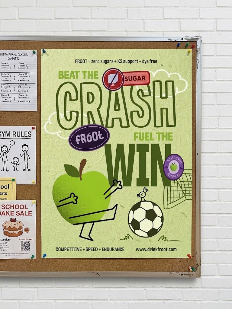
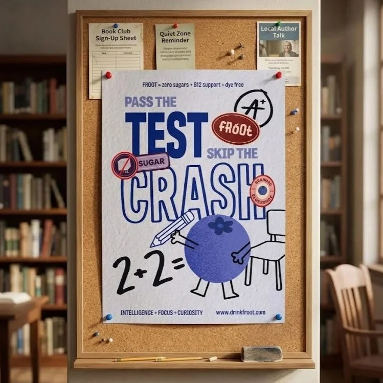
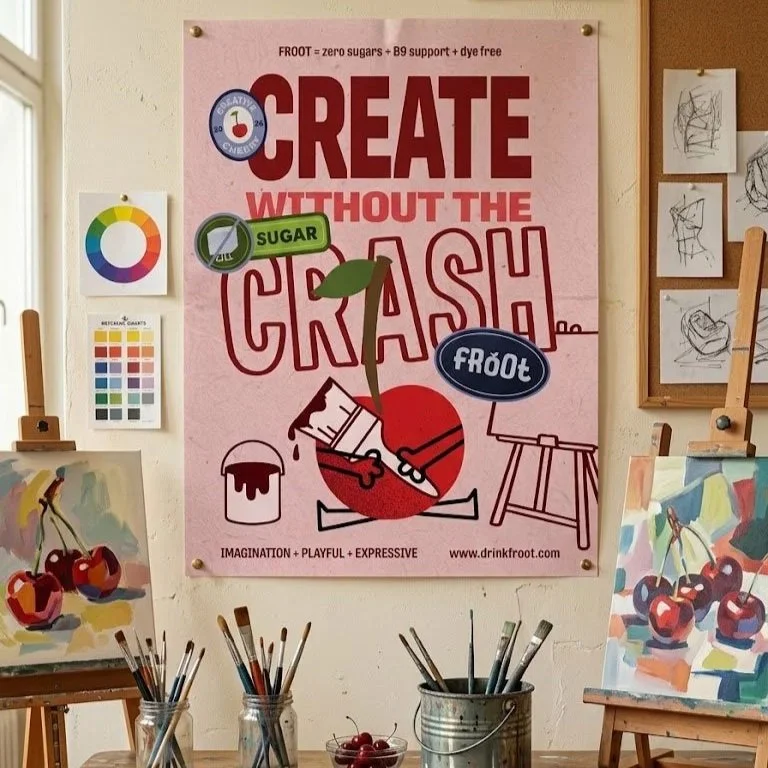
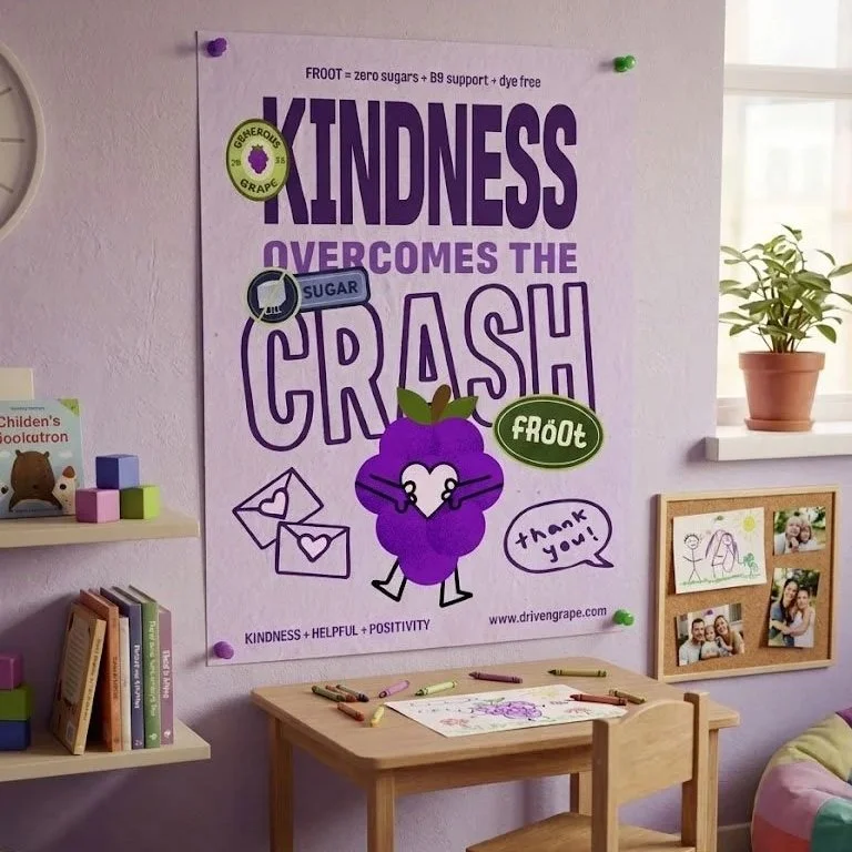
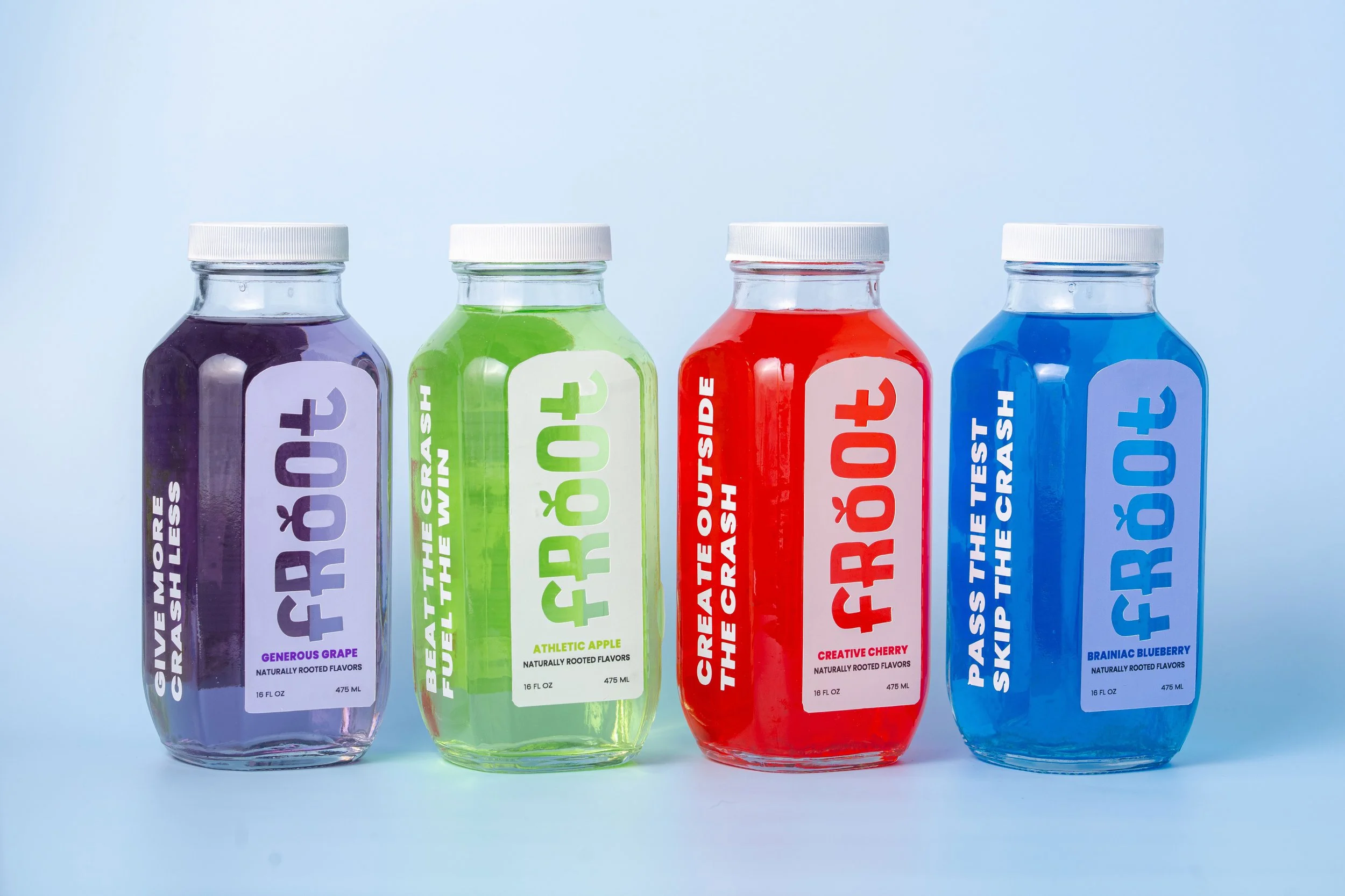
Froot is a children’s juice brand rooted in naturally sourced flavors, offering a refreshing option without the risk of a sugar crash. Made with zero added sugar and free from unnecessary additives, Froot provides clean, natural flavors in every sip. Designed with engaging illustrations to spark creativity and imagination, Froot not only keeps kids hydrated but also encourages self-expression and personality.
Project Overview
Senior Capstone: A fully realized design project that challenges students to apply the knowledge, skills, and tools developed throughout their four years of study. Students have creative freedom to explore their interests while incorporating core principles of design, typography, color, composition, branding, and visual hierarchy. The project is centered around an “-able” word, which serves as the conceptual foundation guiding the project’s identity, design language, and overall execution.
-
My project Froot is driven by the word “reliable”: able to be trusted, depended on, or believed to do what is needed.
-
The concept was to create a reliable, kid-friendly juice brand that gives parents confidence in what their children are drinking. FROOT emphasizes a cleaner product experience without artificial dyes or unnecessary additives, while pairing each flavor with a distinct personality and visual identity designed to engage a younger audience.
-
I chose a packaging-focused project because I wanted to create a tangible product that extends beyond 2D graphics. Packaging allows me to showcase my strengths in design, creativity, and attention to detail while creating a cohesive brand experience.
-
I wanted the physical product to feel clean, sharp, and minimal, reinforcing FROOT as a healthy and reliable juice brand. In contrast, the supporting brand assets and visual language were designed to be bold, playful, and illustration-driven, allowing the brand to feel more energetic and engaging. This contrast created a visual system that balanced a clean product experience with a distinctive and expressive brand identity.
-
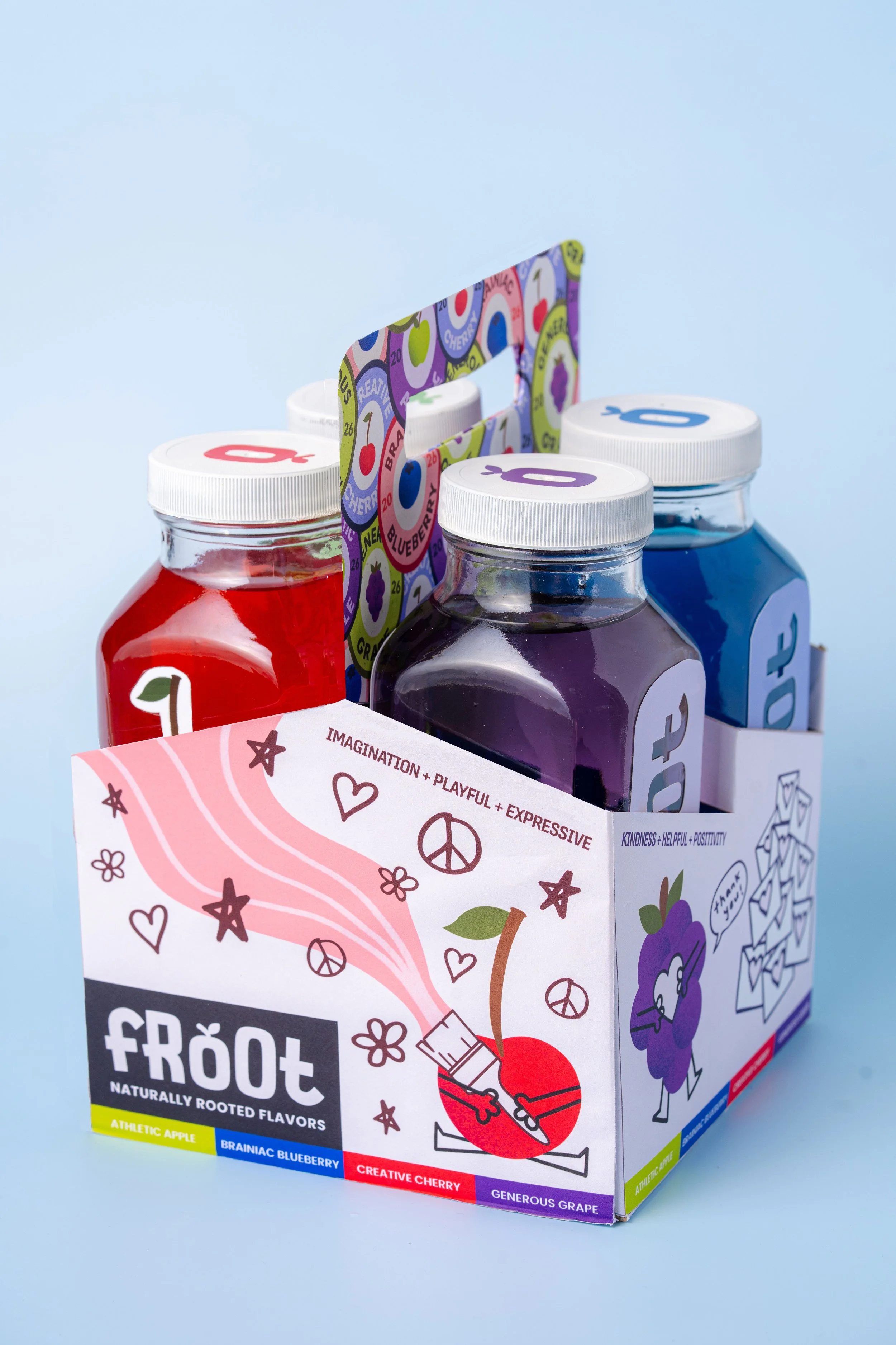
I developed a comprehensive brand system with four juice bottles, a physical bottle carrier, four branded advertising posters, a project walkthrough video, and a 30-second animated commercial.
Meet the Flavors
-
![]()
Brainiac Blueberry
-
![]()
Creative Cherry
-
![]()
Generous Grape
-
![]()
Athletic Apple
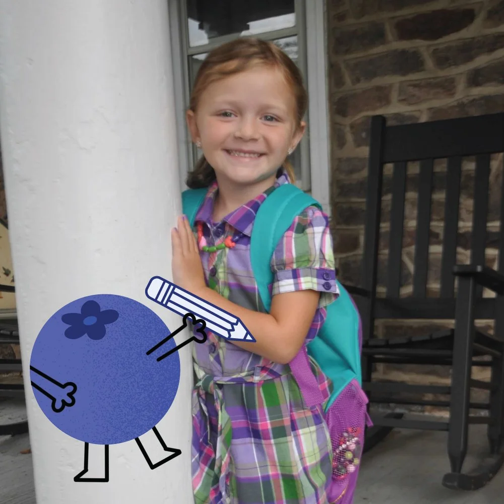
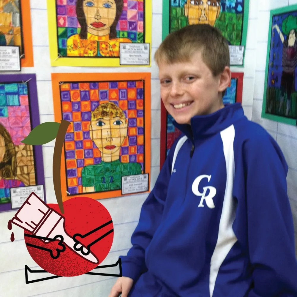

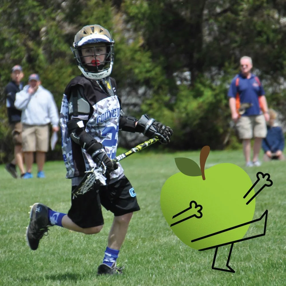
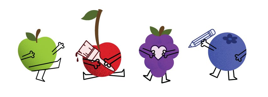
Each FROOT flavor is inspired by one of my siblings, making the project deeply personal from concept to final design. Incorporating these personal connections was important to me because my siblings have played such a meaningful role in shaping the person and designer I am today.
Label Development
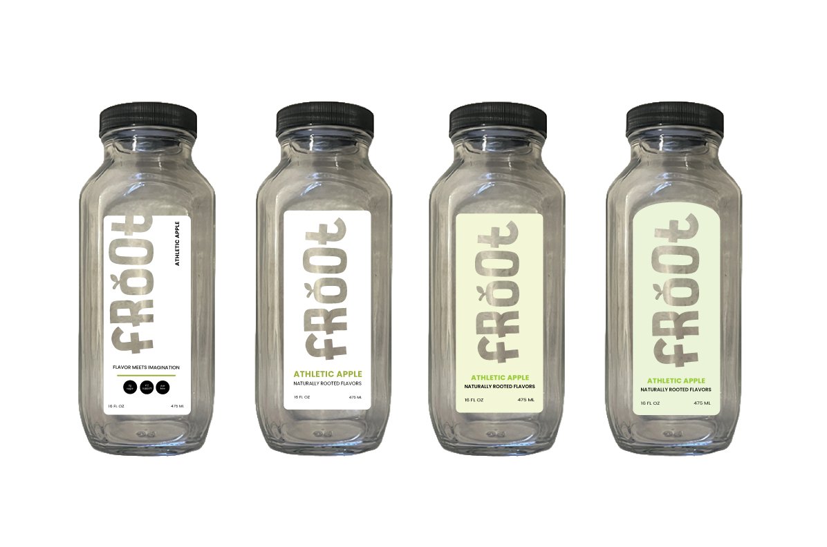
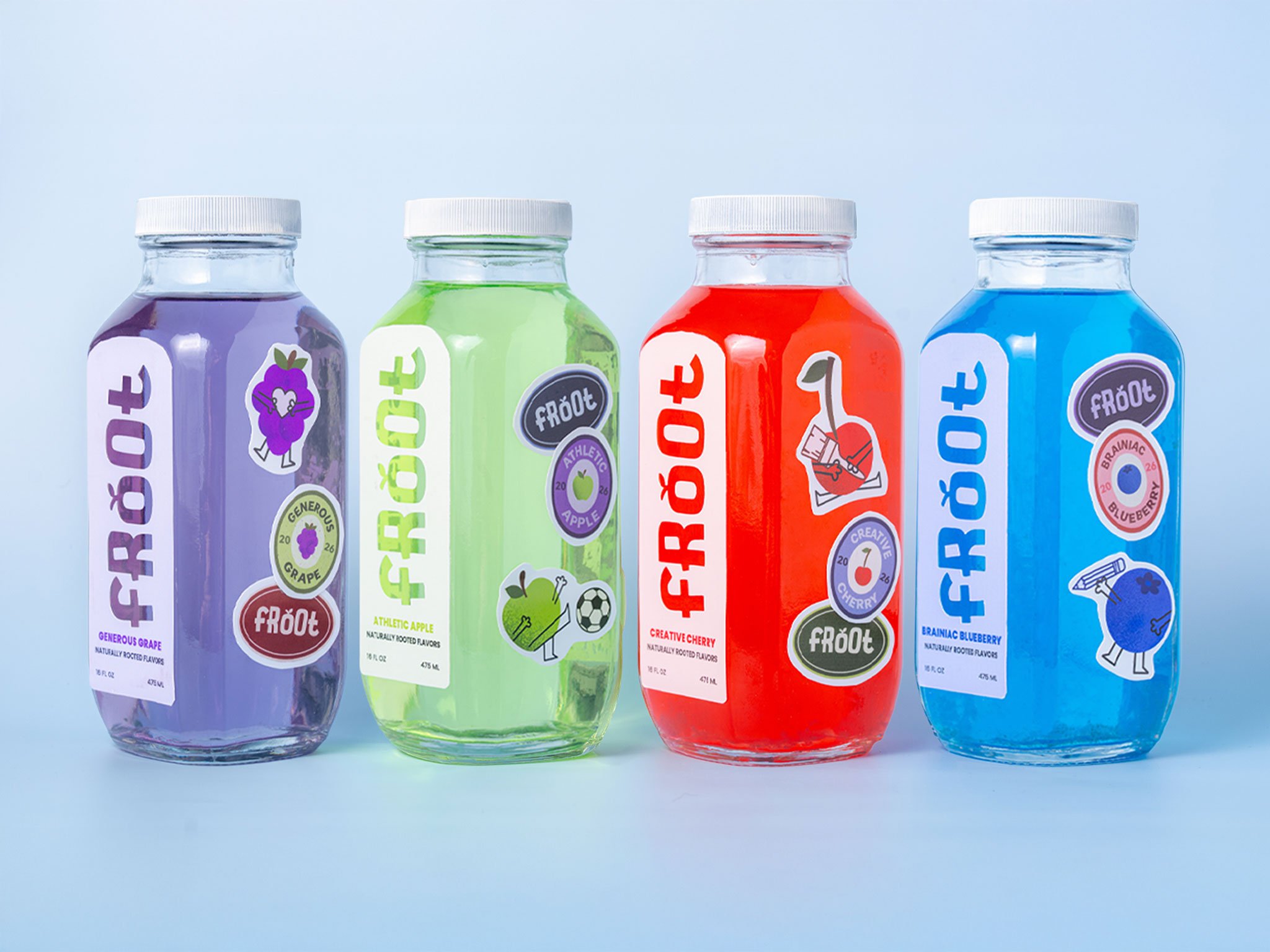
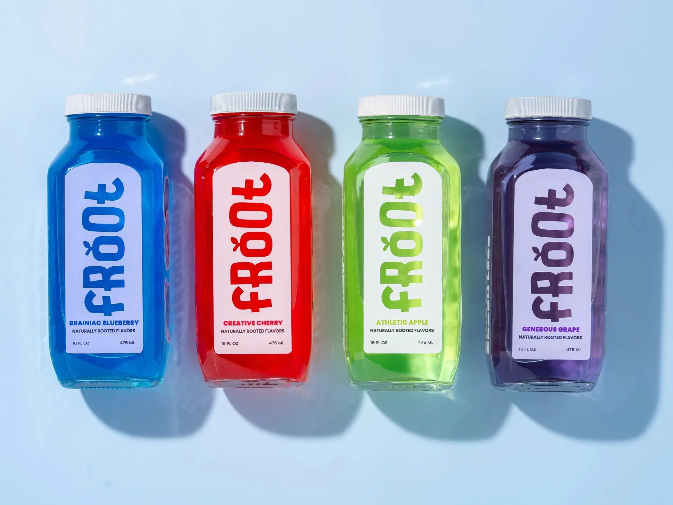
From the beginning, I was drawn to the idea of cutting “FROOT” directly into the label, allowing the natural color of the juice to become part of the logo itself. The arched label shape was intentionally developed to complement the form of the glass bottle while creating a distinctive visual element. Each bottle uses a color system derived from its individual flavor, creating visual differentiation while maintaining a cohesive brand identity.
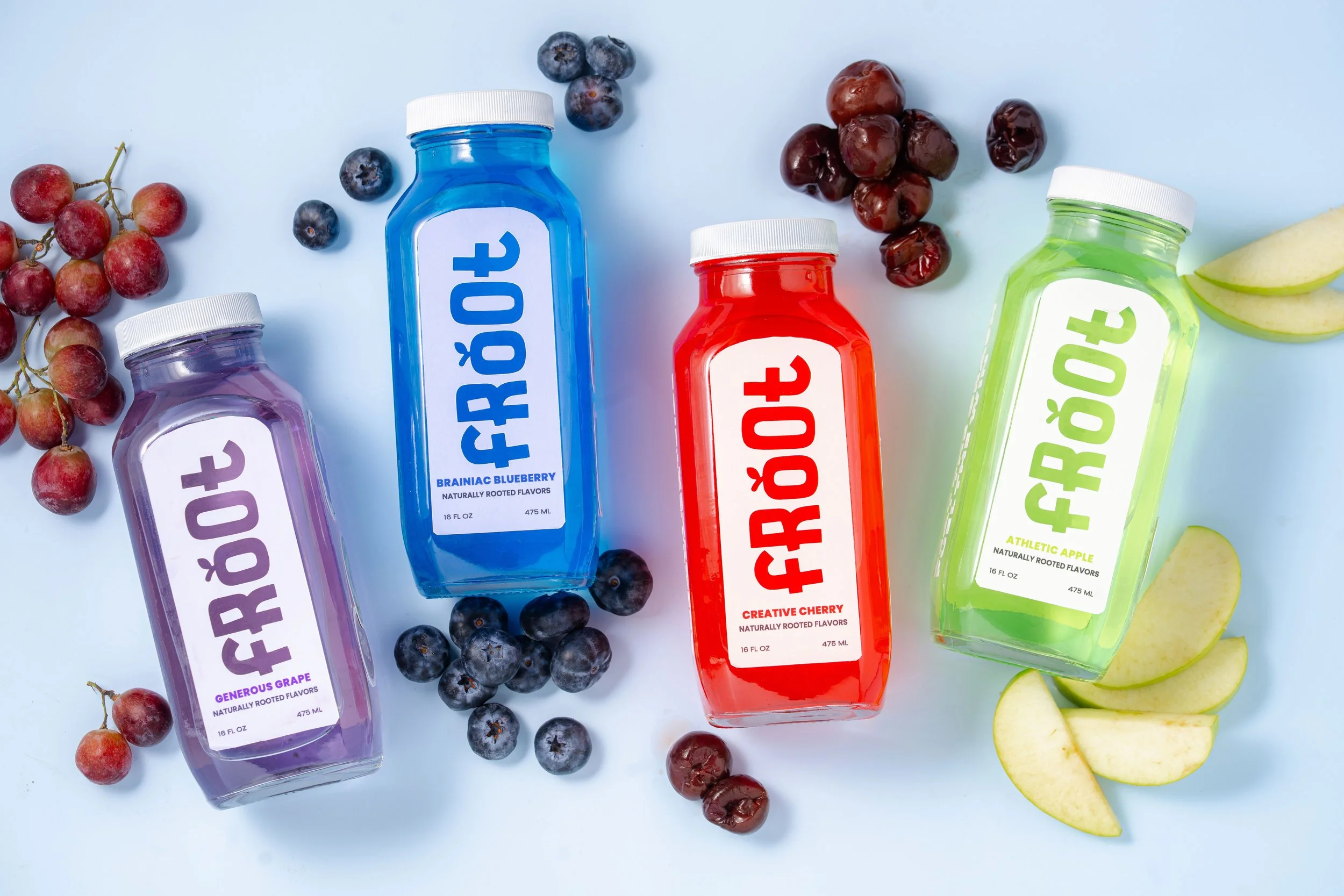
Photography by Tony Hoffer, @hoffermedia
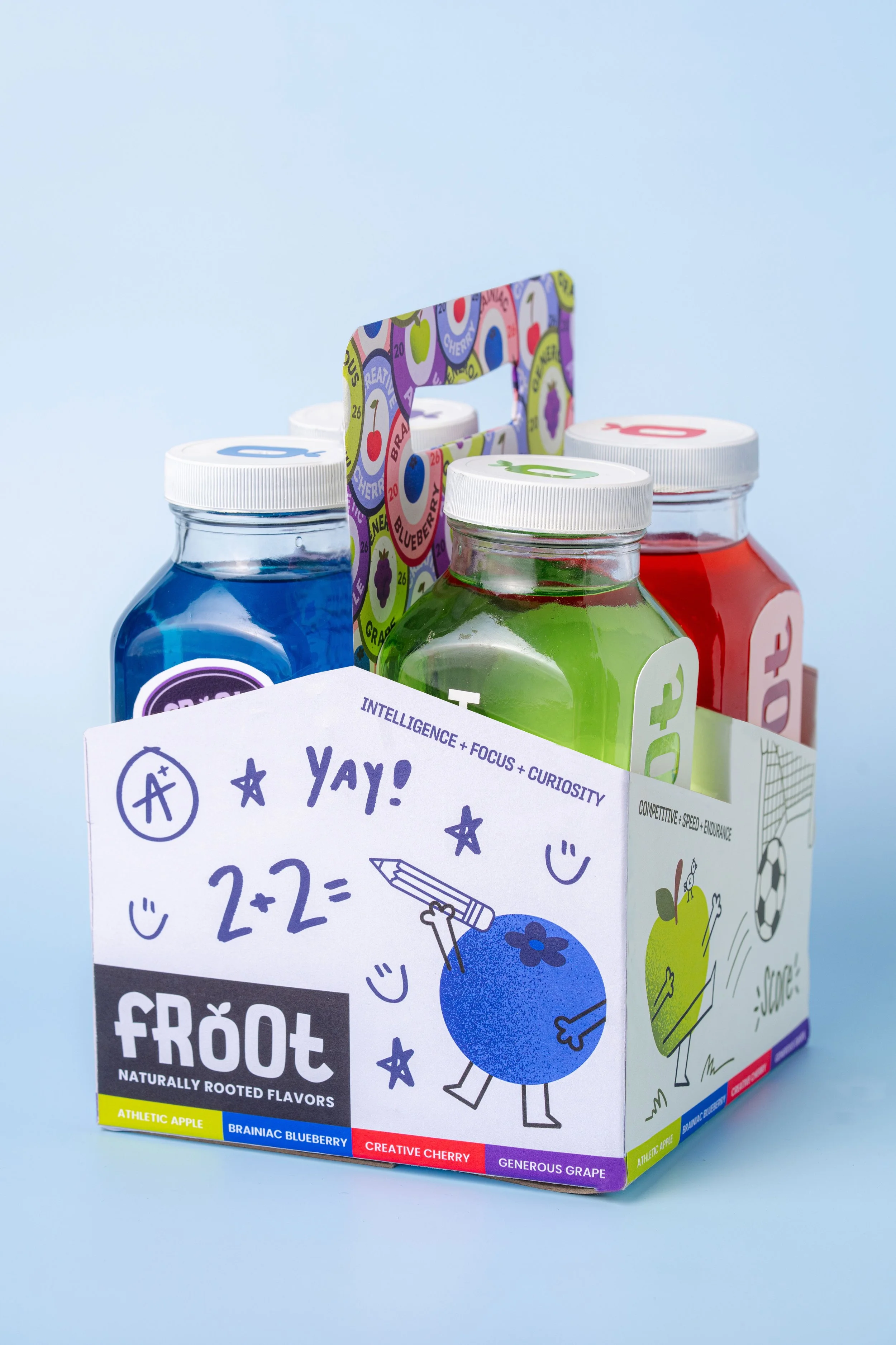
Instagram Reel
Keeping FROOT’s younger audience in mind, I wanted to create something that felt just as fun and energetic as the brand itself. I designed, animated, and produced a branded Instagram Reel that brings FROOT’s playful personality to life through engaging motion, colorful visuals, and storytelling made for social media.
Froot Trailer
As part of FROOT’s interactive experience, I designed and animated a 30-second trailer that introduces the brand in a playful and engaging way. I wanted the commercial to capture the energy and imagination of FROOT’s younger audience while still communicating the product’s benefits in a clear and informative way for parents.